
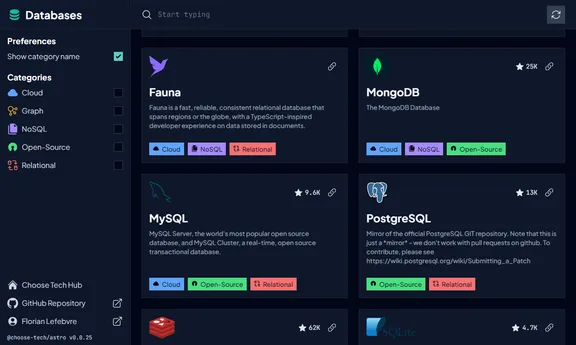
Florian Lefebvre
FullFullstack developer. Freelancer. French.
Open-Source lover. Astro maintainer. Two-time winner of the Astro Community Award.
00:00:00 Central European Time.
About
Younger, I managed a computer fleet before giving game development a try with Unreal Engine 4. In late 2019, my curiosity led me to self-taught exploration in web development. Despite my independent learning, I enrolled early 2023 in a Le Wagon bootcamp, where I obtained certification as a web designer and developer.
I learned a lot of things along the way: web development, UI/UX design (mobile apps, design systems), project management, devops and more! I’m curious and eager to learn new things.
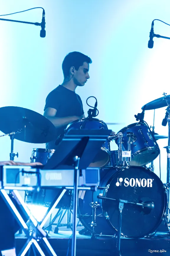
Web development isn’t my sole passion; I also have a deep love for playing music! I’ve been honing my skills with various instruments for over a decade, including drums, percussion, bass guitar, and even a bit of piano.
Services
€55/hour
I'm a frontend specialist with good knowledge in backend, UI/UX, and DevOps. I'm dedicated to crafting seamless, efficient, and user-friendly solutions.
Frontend
I care about creating delightful interfaces, crafting pixel-perfect, responsive designs, paying attention to accessibility, and optimizing performance for an exceptional user experience.
Custom Astro Integrations
Astro Integrations allow to hook into the build process, dev server, and more. As a maintainer of Astro and numerous integrations, I can help you create one tailored to your needs.
Backend & CMS
I have a solid proficiency in backend development including SQL knowledge. I like to work with Git-backed headless CMSs to create scalable, personalized content architectures.
UI/UX
I specialize in UI/UX, crafting efficient and intuitive interfaces that prioritize a seamless user experience, blending functionality with aesthetic appeal.
DevOps
I prioritize strong CI/CD workflows with GitHub Actions, set up previews on Vercel/Netlify, and create sharable dev environments with Docker Compose.
Cross-platform
I can make cross-platform applications, seamlessly extending functionality across mobile, web, and desktop platforms for a unified user experience.
Good practices
I advocate for establishing best practices from development to production, ensuring less bugs will reach production.
If you're intrigued by what you've read and interested in collaboration, feel free to explore my contact details!
ContactExperiences
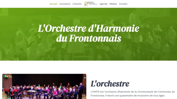
In this Astro site, I’m migrating Vue components from Options API to Composition API. I also introduced TypeScript , Prettier and more goodies!
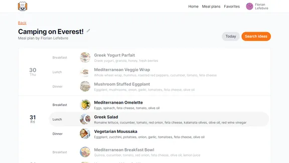
Given a mockup, I built the frontend using Next.js and Tailwind . A big part of the work was focused on performance because of numerous API calls, helped by Tanstack Query .
Testimonials

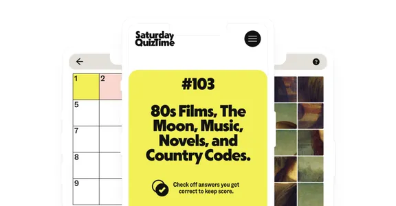
William Rainbird
saturdayquiztime.com.au owner
Florian is an absolute pleasure to work with. Despite living on the other side of the world, communication has been great and he’s always been super responsive and eager to help out or give professional advice. Initially brought on to help me maintain a project, he’s improved the website tenfold, and I’ve also learned a lot myself in the process.

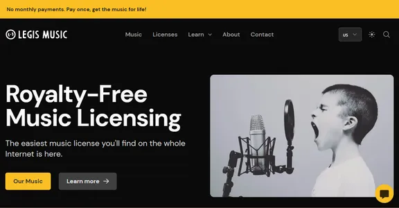
Pablo Olondriz
legismusic.com owner
Florian is a super talented and skilled developer. I’ve been working with him for many months now and has helped me to reach the next level in my online business: always helpful, always responsive and on top of that, he’s a very good person. He’s become an essential part of our work operations since I met him.

Simon Lefort
Freelancer
Florian is a highly competent and creative freelancer in his field. His excellent communication skills during projects and his human qualities have made him my first choice for almost a year when I have an interface to design or implement.
More projects
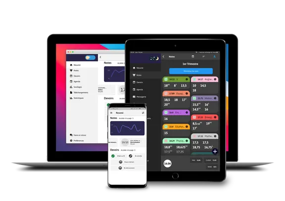
This for Le Wagon’s bootcamp final project. I was my group’s dev lead. We built this using Ruby on Rails , Tailwind and Chat GPT.
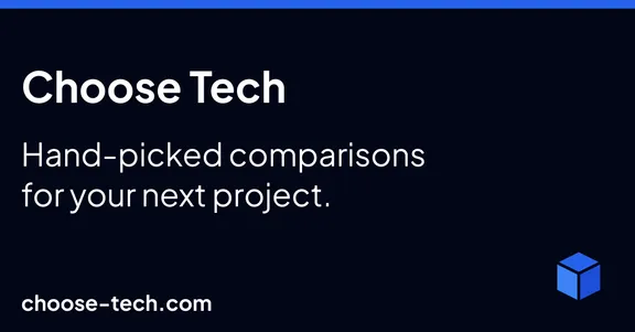
There is much more! But the page is getting long already, so here are a few links: Portfolio , op-ent , Nuxt3 Medusa starter , shortcuts-app , Glutton Runner …
Feel free to reach out if you're looking for a developer, have a question or just want to connect. I may be able to take new missions depending on my availability (top-right indicator).
contact@florian-lefebvre.dev